

Project Summary
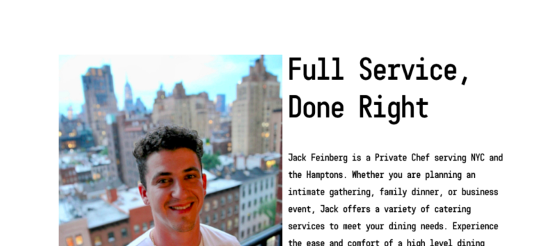
FeinFoods is a small business lead by Jack Feinberg, a Private Chef serving NYC and the Hamptons. He wanted to overhaul Feinfood’s digital brand to reflect his current clientele and services. He wanted his website to be easily findable and usable with a modern feel. Through market research, user research, and user field studies FeinFoods was reimagined.
Market Research, User Research, User Field Study, UX Writing, UX Design
Skills
Tools
Figma
Team
me (solo project)
Market & User Research
What market gaps could FeinFood’s fill? What was New York City’s private culinary service scene lacking?
To investigate I researched and analyzed other private chef’s and chef service companies based in New York City.
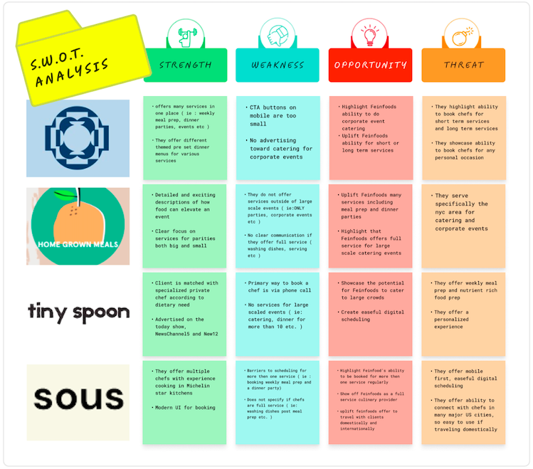
Using the SWOT analysis above, the most striking gap in New York’s private culinary service market was the lack of a seamless, full service, “one-stop-shop” for clients wide ranging personal and corporate culinary needs. This information led me to my next question-
Who were Feinfood’s clients? What events, cuisine, and feeling did clients look to Feinfood’s services for?
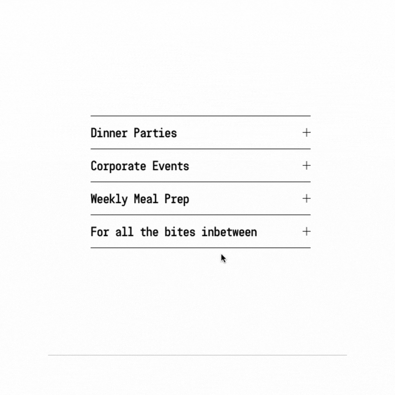
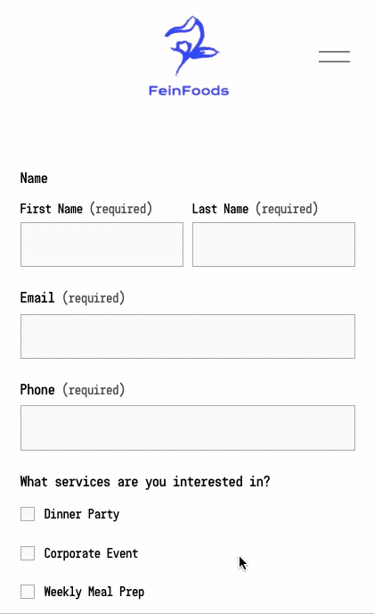
I met with Feinfood’s founder looking for an answer to the question above. A conversation that began with the two simple questions, “who typically contacts you for services” and “what events do you typically cook for”, turned into a one hour conversation about food as medium for connection and care. Through this One-on-One interview I learned who contacts Feinfood’s for services and why they reach out to him, he specifically said he is contacted most for Weekly Meal Prep. Please see graphic below :
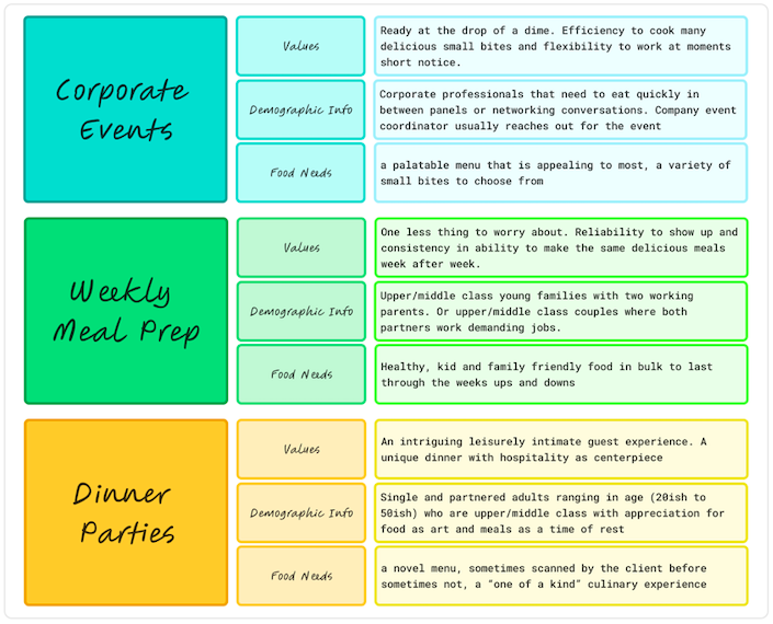
The interview illuminated who his clients were, what they valued, and what their food needs were. It gave significant insights into who would be interacting with FeinFood’s website. However, I still did not know what it was like to interact with Feinfood’s current website. I wanted to know :
What issues did current clients run into in the real world? What pain points could I correct for?
I decided the most time efficient and accessible way for me to find answers to this question was a direct observational user field study in the user’s natural environment. However, due to time limitations, my study was only conducted on one of the three main services Feinfood’s catered too, Weekly Meal Prep. The clients I observed were a young couple with demanding full time jobs, they had three kids under the age of six and two dogs. I observed them during the day in their home while they were trying to book their next FeinFood’s meal prep appointment. Below are the usability issues I observed:
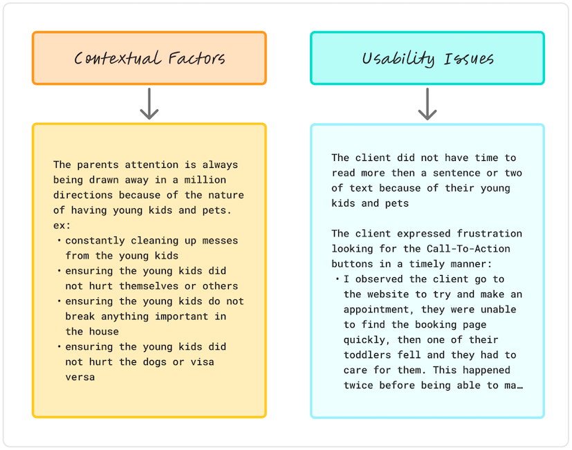
In summary, from the direct observational user field study in the user’s natural environment, I found the main usability issues to solve for were unclear Call-to-Action buttons and too much text.
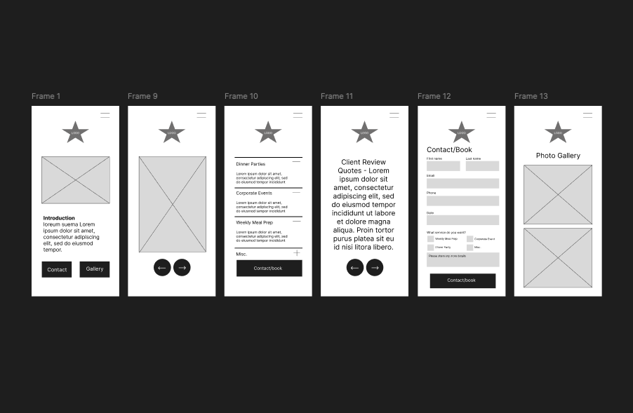
Mobile Lo-Fi Explorations
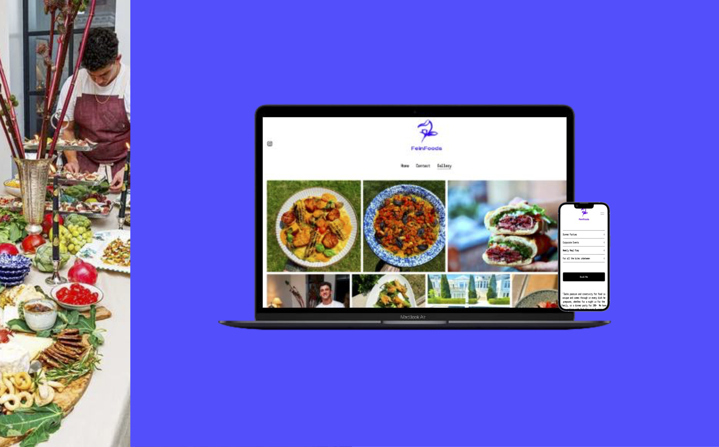
Studying Feinfoods old website I found its content hierarchy unclear and disorganized. It was important for the new website’s SEO to be updated in order for potential clients using large language models (LLM), like ChatGPT, to find them. I wanted the new website to emphasize a recognizable content hierarchy and have a mobile first design.
I started my design with a low fidelity sketch of a mobile user interface. I went on to create low fidelity sketches of desktop user interfaces. Please see below:
Rebranding & UX Writing
Feinfood’s required a design that would communicate its ability for reliability and efficiency, while conveying its potential to create unique experiences. Additionally, I wanted to guarantee that it could communicate the wide range of services offered and simultaneously correct for current pain points of too much text and unclear call-to-action buttons. Connecting what I learned through market analysis, the qualitative interview, and direct user observational study, I concluded that best redesign of Feinfood’s website would be a minimalist design. I kept this front of mind going into Feinfoods rebrand. The question became -
How do I create a new minimalist logo, color palette, and voice while maintaining Feinfoods essence?
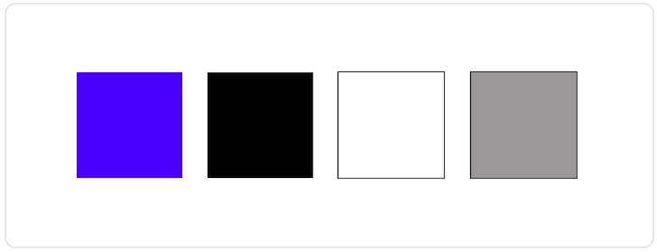
Problem : Old color pallet was too dark and aesthetically dated. It did not reflect a modern or minimal feel
Solution : I created a new cohesive and minimal color pallete that allowed color to act as a tool to get the users attention. Please see color palette below
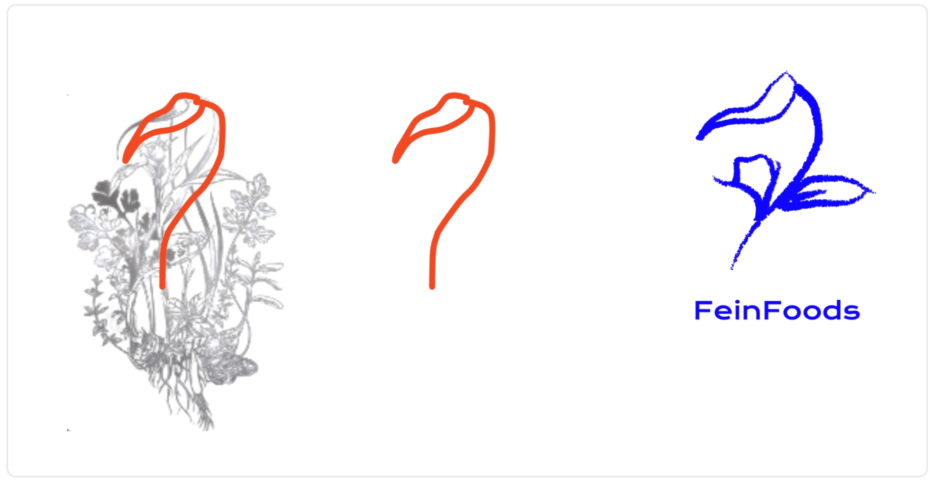
Feinfoods’s founder noted that he wanted to keep the flower in his previous logo because it was native to his hometown.
Problem: Old logo was too dark, too detailed and hard to transfer to various digital mediums (ie: instagram thumbnail, TikTok video) and real world merchandise (ie: hats, t-shirst, tote bags etc. ). It also did not align with the minimalist redesign.
Solution : I simplified the main attribute of the flower and created an abstraction of it. The simplicity kept with the minimalist redesign and made it easier to transfer the logo onto merchandise and advertise on digital platforms. Please see logo journey below:
I used the previous market and user research informed the new UX Writing for Feinfoods website.
Problem : current writing on website is too formal and disjointed, it does not appeal to new weekly meal prep and dinner party clientele
Solution : wrote clear, engaging, and modern UX writing. The UX writing that is a appealing to a large breathe cliente
Final Product
